

A strategic approach to CRO that actually works
(what to test or optimize)

Don’t start with random tests
The first step in any effective CRO process is to focus on strategic opportunities.
You want to identify the specific points in your funnel where improvements will have the biggest impact on core metrics like AOV, LTV or conversion rates—rather than jumping into tests without direction.

Find the leak points
If you’re focusing on Ecom, you can pull your closed-funnel data from one of the standard reports in GA4: ‘Purchase Journey’. This will give you user counts at each stage of the ecom funnel.
I like to then run it through my calculator to pinpoint the largest leakages in the funnel (simply multiply user counts by AOV for each stage) and benchmark it against competitors in the industry.
This allows me to prioritize areas for testing and optimization that can generate the highest revenue gains.
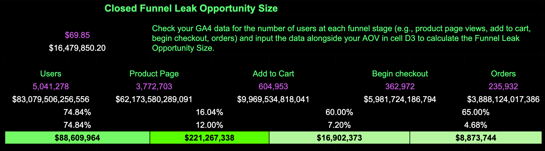
In the example above, the biggest opportunity lies in improving the drop-off between PDP and add to cart (ATC) stages.
But this higher drop-off can be caused by a variety of factors—ranging from unclear messaging to poor page design or even a lack of urgency. In order to narrow it down, you need to understand the customer problem behind it.
What’s the customer problem?
By asking yourself the following questions you can often uncover actionable insights:
What’s the problem? (customers are dropping off from PDPs before adding products to their cart)
Who is impacted? (primarily first-time visitors or mobile users)
Where does this problem negatively impact growth? (the drop-off is leading to lower mobile conversion rates and fewer ATC actions)
Why does this problem occur? (CTA is not visible to most users on mobile as it's placed too far down the page)
To diagnose the "why," you can use tools like heatmaps and heuristic analysis to gain deeper insights into how users interact with the page.
For example:
Heatmaps may show that users aren’t scrolling far enough to see the ATC button, indicating that critical content or CTAs are not visible on smaller mobile screens.
Click maps might reveal that users are interacting with images or variant options but not completing actions, possibly due to confusion about selecting product variations like size or color.
Heuristic analysis (a usability review) could uncover issues such as missing trust signals like reviews or badges, or overly complex product descriptions that overwhelm visitors.
By identifying these friction points using user behavior data and usability analysis, you can clarify the problem and design focused tests to address it.
Once you’ve gathered insights—such as identifying high PDP drop-offs—and explored the possible causes, you can start developing targeted solutions.
Is this a test or an optimization?
Some insights from your research are so obvious, they don’t need validation with testing.
There’s a difference between experiments—where you’re trying something fundamentally new with some risk involved—and optimizations, which are smaller tweaks that make what you already have work better.
Fixing broken links, shortening overly complex forms, or improving mobile accessibility aren’t things you need to A/B test.
Generating testable solutions
In our case, heuristic analysis and heatmap data suggest a need to focus on improving CTA visibility, enhancing social proof and urgency triggers, and streamlining the variant selection process.
For each of these areas, solutions can draw from proven best practices or tactics that have consistently delivered results in similar scenarios. This ensures that your efforts are both strategic and grounded in data-driven insights, maximizing the likelihood of success.
Testing sticky headers can keep the ATC button in constant view, reducing friction and guiding users toward action as they scroll.
Incorporating real-time purchase indicators or scarcity messages leverages decision-making triggers, encouraging faster actions and minimizing cart abandonment.
Streamlining variant selection reduces cognitive load, making it easier for users to progress through the buying process with fewer barriers.
Prioritizing solutions with ICE
Once you have solution ideas, the next step is evaluating them using the ICE framework (I = Impact; C = Confidence; E = Ease):

Impact — how much will this solution move the needle on your primary metric?
High impact solution — sticky header to keep the ATC button visible at all times. If users aren’t scrolling far enough to see the CTA, making it persistent could significantly reduce friction and improve ATC rates.
Low impact solution — would be changing the button color on the Add-to-Cart CTA. Unless the current button color is unreadable or blends into the background, this is unlikely to create a noticeable lift in conversions.
Confidence — how sure are you that this solution will work based on user data or past results?
High confidence solution —if heatmaps and clickmaps showed that users are getting stuck interacting with variants but not completing the action, then streamlining variant selection by simplifying dropdowns would likely be a high confidence solution.
Low confidence solution — adding an animation to the ATC button. While it could make the button more noticeable, there’s no strong evidence to suggest it would meaningfully influence user behavior.
Ease — how easy is this solution to implement, considering design and development effort?
High ease — updating the placement of the CTA by moving it above the fold on mobile. This is a simple layout change that doesn’t require new assets or advanced development.
Low ease — creating a dynamic 'Only 3 left in stock' scarcity widget for product pages, which requires integration with your inventory system.
Putting it all together
Using the ICE framework, you can weigh your ideas across these three dimensions to prioritize what to test first.
Start with high-impact, high-confidence, and low-effort changes to maximize early wins while allocating resources strategically for larger initiatives.
As traffic allows, expand your focus—testing different parts of the funnel simultaneously, and assessing performance regularly to uncover new areas for improvement.
Treat CRO as a continuous cycle of experimentation and iteration, identifying fresh customer problems, designing new solutions, and refining the user journey. Staying consistent is the key here.